Skip to the collection
Skip to references

Public vault · every note in the open

Steal this vault

201 entries, 447 steal-notes — 281 by hand, 166 model drafts. 201 results have public source URLs. Source and classification review are recorded separately on each reference.

What are you building?
Explore the additions
Refine: kind, font, color, order
e.g. #e4572e
Jump to results
49–72 of 201 references

Handkerchief

Editorial · packaging

Source: pending · Classification: pending

  • Steal · typographymodel draft

    Printed text is set in a single condensed gothic all-caps face, letter-spaced tightly across the width of the cloth so the longest line determines the measure. The name is the only element allowed to break the line, creating a deliberate hierarchy by width rather than weight or size.

Fonts: condensed gothic all-caps

public-domain

View original ↗
Source & usage rights

Original: Creator not recorded. Source verification: pending review.

Recorded rights label: public-domain. Original work and reproduction rights belong to their owners. A note license does not grant rights to copy a screenshot, trademark or design.

Trova notes: apply the principles in your own work, including commercial projects. Bulk republication or resale is not permitted. Usage terms.

Captured: 2026-10-10. Capture does not establish source verification.

Martin Vanden Bogaert Desjardins

Martin Vanden Bogaert Desjardins

Editorial · poster

Source: pending · Classification: pending

  • Steal · typographymodel draft

    The name is engraved in a single line of roman capitals whose serifs are extended until they almost meet, turning the baseline into a continuous horizontal bar that runs the full width of the oval frame.

private-reference-only

View original ↗
Source & usage rights

Original: Creator not recorded. Source verification: pending review.

Recorded rights label: private-reference-only. Original work and reproduction rights belong to their owners. A note license does not grant rights to copy a screenshot, trademark or design.

Trova notes: apply the principles in your own work, including commercial projects. Bulk republication or resale is not permitted. Usage terms.

Captured: 2026-10-10. Capture does not establish source verification.

Self-Portrait

Self-Portrait

Editorial · poster

Source: pending · Classification: pending

  • Steal · typographymodel draft

    The signature and date are placed directly under the lower lip of the portrait in a size so small that they read as a single grey line rather than individual letters; the measure of the inscription exactly matches the width of the mouth above it.

private-reference-only

View original ↗
Source & usage rights

Original: Creator not recorded. Source verification: pending review.

Recorded rights label: private-reference-only. Original work and reproduction rights belong to their owners. A note license does not grant rights to copy a screenshot, trademark or design.

Trova notes: apply the principles in your own work, including commercial projects. Bulk republication or resale is not permitted. Usage terms.

Captured: 2026-10-10. Capture does not establish source verification.

Reine de Joie

Reine de Joie

Editorial · poster

Source: pending · Classification: pending

  • Steal · typographymodel draft

    The title REINE DE JOIE is broken into three stacked lines with the middle line (DE) set in a markedly smaller size and centred; the resulting stepped silhouette is mirrored by the three horizontal bands of the decorative border.

private-reference-only

View original ↗
Source & usage rights

Original: Creator not recorded. Source verification: pending review.

Recorded rights label: private-reference-only. Original work and reproduction rights belong to their owners. A note license does not grant rights to copy a screenshot, trademark or design.

Trova notes: apply the principles in your own work, including commercial projects. Bulk republication or resale is not permitted. Usage terms.

Captured: 2026-10-10. Capture does not establish source verification.

La revue blanche

La revue blanche

Editorial · poster

Source: pending · Classification: pending

  • Steal · typographymodel draft

    The masthead LA REVUE BLANCHE is set in a condensed grotesque whose x-height is deliberately lowered so the ascenders and descenders create a rhythmic up-and-down silhouette against the white ground.

private-reference-only

View original ↗
Source & usage rights

Original: Creator not recorded. Source verification: pending review.

Recorded rights label: private-reference-only. Original work and reproduction rights belong to their owners. A note license does not grant rights to copy a screenshot, trademark or design.

Trova notes: apply the principles in your own work, including commercial projects. Bulk republication or resale is not permitted. Usage terms.

Captured: 2026-10-10. Capture does not establish source verification.

Aristide Bruant

Aristide Bruant

Editorial · poster

Source: pending · Classification: pending

  • Steal · typographymodel draft

    The name ARISTIDE BRUANT is letter-spaced so tightly that adjacent letters nearly touch; the tracking is reduced until the counters of the B and R become the dominant negative shapes.

private-reference-only

View original ↗
Source & usage rights

Original: Creator not recorded. Source verification: pending review.

Recorded rights label: private-reference-only. Original work and reproduction rights belong to their owners. A note license does not grant rights to copy a screenshot, trademark or design.

Trova notes: apply the principles in your own work, including commercial projects. Bulk republication or resale is not permitted. Usage terms.

Captured: 2026-10-10. Capture does not establish source verification.

Zodiaque ("La Plume")

Zodiaque ("La Plume")

Editorial · poster

Source: pending · Classification: pending

  • Steal · typographymodel draft

    The single word ZODIAQUE is set in an all-caps display face whose weight is carried almost entirely by the thick vertical stems; the horizontals and curves are thinned to hairline so the word reads as a row of dark posts linked by fine strokes.

private-reference-only

View original ↗
Source & usage rights

Original: Creator not recorded. Source verification: pending review.

Recorded rights label: private-reference-only. Original work and reproduction rights belong to their owners. A note license does not grant rights to copy a screenshot, trademark or design.

Trova notes: apply the principles in your own work, including commercial projects. Bulk republication or resale is not permitted. Usage terms.

Captured: 2026-10-10. Capture does not establish source verification.
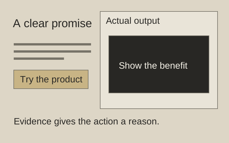
Framer — homepage hero

Dark Premium · landing page

Source: pending · Classification: pending

Show the result near the next action.

Original principle diagram · Draft explanation

Show the result near the next action.

What to borrow: Give a product outcome more room than decorative copy.

When to use this principle
When it works
Products whose actual output explains the benefit.
When to avoid it
Invented results, empty canvases, or product images without explanation.

Original principle diagram — a model-drafted explanation, not a reconstruction of the source. Trova · AI-assisted illustration. Original Trova diagram.

  • Steal · grid/layoutmodel draft

    The CTA pair, a white "Get started for free" and a dark grey "Download app" with a download arrow, sits left-aligned under the headline while "New: Skills →" sits at the right end of the same row. Steal a CTA row that carries the release link at its far end, so one line serves both conversion and news.

Fonts: GT Walsheim · Original: Framer

private-reference-only

View original ↗
Source & usage rights

Original: Framer. Source verification: pending review.

Recorded rights label: private-reference-only. Original work and reproduction rights belong to their owners. A note license does not grant rights to copy a screenshot, trademark or design.

Trova notes: apply the principles in your own work, including commercial projects. Bulk republication or resale is not permitted. Usage terms.

Captured: 2026-10-10. Capture does not establish source verification.
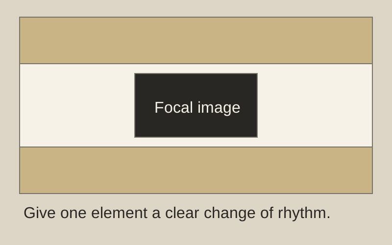
A nation that enslaves another cannot itself be free

Editorial · poster · via V&A Collections

Source: pending · Classification: rejected

Let one image interrupt the rhythm.

Original principle diagram · Draft explanation

Let one image interrupt the rhythm.

What to borrow: Give a focal image a distinct horizontal band.

When to use this principle
When it works
A single visual that carries the main message.
When to avoid it
Dense interfaces where decorative bands disrupt the working sequence.

Original principle diagram — a model-drafted explanation, not a reconstruction of the source. Trova · AI-assisted illustration. Original Trova diagram.

  • Steal · grid/layoutmodel draft

    The page is divided into three horizontal bands of unequal height: top green band (map and two photos), middle white band (crowd and camera), bottom green band (title only). The middle band is the largest and contains the single focal object (camera lens) that overlaps both green fields.

Original: 1979-1980

private-reference-only

View original ↗
Source & usage rights

Original: 1979-1980. Source verification: pending review.

Recorded rights label: private-reference-only. Original work and reproduction rights belong to their owners. A note license does not grant rights to copy a screenshot, trademark or design.

Trova notes: apply the principles in your own work, including commercial projects. Bulk republication or resale is not permitted. Usage terms.

Captured: 2026-10-09. Capture does not establish source verification.
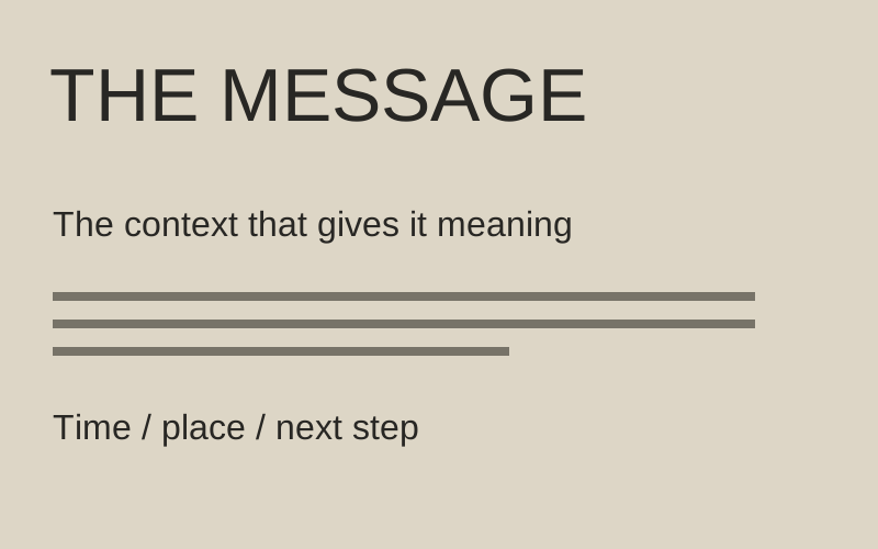
Political Poster Show 1977

Brutalist / Indie · poster · via V&A Collections

Source: pending · Classification: rejected

Three sizes. One reading order.

Original principle diagram · Draft explanation

Three sizes. One reading order.

What to borrow: Assign distinct type scales to title, context, and logistics.

When to use this principle
When it works
A short announcement with a clear information hierarchy.
When to avoid it
Long prose or equal-weight actions that cannot support an oversized title.

Original principle diagram — a model-drafted explanation, not a reconstruction of the source. Trova · AI-assisted illustration. Original Trova diagram.

  • Steal · typographyEvidence rejected — see findingsmodel draft

    All display text is set in a single bold grotesque, upper-case only, with no letter-spacing variation. Hierarchy is created solely by size changes (three discrete sizes) and by colour blocks: yellow on black for the event title, white on orange for the subtitle. No italics, no rules, no secondary weights.

Original: Rachael Romero · 1977

private-reference-only

View original ↗
Source & usage rights

Original: Rachael Romero · 1977. Source verification: pending review.

Recorded rights label: private-reference-only. Original work and reproduction rights belong to their owners. A note license does not grant rights to copy a screenshot, trademark or design.

Trova notes: apply the principles in your own work, including commercial projects. Bulk republication or resale is not permitted. Usage terms.

Captured: 2026-10-09. Capture does not establish source verification.
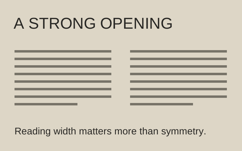
Zimbabwe — One Enemy: Imperialism

Print-Tech Paper · poster · via V&A Collections

Source: pending · Classification: pending

Display announces. Text explains.

Original principle diagram · Draft explanation

Display announces. Text explains.

What to borrow: Pair a forceful display heading with a calm reading measure.

When to use this principle
When it works
Editorial layouts with a short title and substantive explanation.
When to avoid it
Condensed faces for long text or columns too narrow for comfortable reading.

Original principle diagram — a model-drafted explanation, not a reconstruction of the source. Trova · AI-assisted illustration. Original Trova diagram.

  • Steal · typographymodel draft

    Two voices and nothing between them: enormous condensed bold sans for the two headlines that bracket the poster top and bottom, and typewriter monospace for every word of body copy. No intermediate sizes, no third face. The absence of a middle tier is what makes both ends read as deliberate.

Fonts: condensed grotesque, typewriter monospace · Original: Poster Collective, Tolmers Square

V&A Collections

View original ↗
Source & usage rights

Original: Poster Collective, Tolmers Square. Work date: ca. 1977. Primary metadata checked 2026-10-01. V&A API O117445 title and brief description identify the double-sided poster. Capture correspondence and reproduction rights remain unverified.

Recorded rights label: V&A Collections. Original work and reproduction rights belong to their owners. A note license does not grant rights to copy a screenshot, trademark or design.

Trova notes: apply the principles in your own work, including commercial projects. Bulk republication or resale is not permitted. Usage terms.

Captured: 2026-08-02. Capture does not establish source verification.

Toulouse-Lautrec — Moulin Rouge: La Goulue

Toulouse-Lautrec — Moulin Rouge: La Goulue

Editorial · poster · via Art Institute of Chicago

Source: pending · Classification: pending

  • Steal · colormodel draft

    Five flat values and no shading anywhere: black silhouette crowd behind, the lit cream subject in the middle, a large desaturated grey cut-out figure in front. Depth is built purely by value separation and overlap — the nearest figure is the dullest, the subject the brightest. Invert the usual instinct to make foreground elements the most saturated.

Fonts: hand-lettered condensed sans · Original: Henri de Toulouse-Lautrec

CC0 · Art Institute of Chicago

View original ↗
Source & usage rights

Original: Henri de Toulouse-Lautrec. Work date: 1891. Primary metadata checked 2026-10-01. Art Institute API artwork 82287 matches title, artist and date; API marks the museum image public domain. Capture correspondence and reproduction rights remain unverified.

Recorded rights label: CC0 · Art Institute of Chicago. Original work and reproduction rights belong to their owners. A note license does not grant rights to copy a screenshot, trademark or design.

Trova notes: apply the principles in your own work, including commercial projects. Bulk republication or resale is not permitted. Usage terms.

Captured: 2026-08-02. Capture does not establish source verification.

die neue linie — cover, September 1929

die neue linie — cover, September 1929

Swiss / International · editorial · via V&A Collections

Source: pending · Classification: pending

  • Steal · colormodel draft

    Exactly one saturated colour — a vermillion field holding the right ~28% as a full-bleed column — against an otherwise fully greyscale photograph. One hue, one large flat area, zero elsewhere. The discipline is what makes the orange read as loud; a second colour anywhere would halve it.

Fonts: geometric sans, lowercase · Original: László Moholy-Nagy; Herbert Bayer (title/art direction)

V&A Collections

View original ↗
Source & usage rights

Original: László Moholy-Nagy; Herbert Bayer (title/art direction). Work date: 1929. Primary metadata checked 2026-10-01. V&A API O1348469 identifies the cover proof and designers; September is not independently established. Capture correspondence and reproduction rights remain unverified.

Recorded rights label: V&A Collections. Original work and reproduction rights belong to their owners. A note license does not grant rights to copy a screenshot, trademark or design.

Trova notes: apply the principles in your own work, including commercial projects. Bulk republication or resale is not permitted. Usage terms.

Captured: 2026-08-02. Capture does not establish source verification.

Herbert Bayer — Universal alphabet, proof sheet

Herbert Bayer — Universal alphabet, proof sheet

Swiss / International · type specimen · via V&A Collections

Source: pending · Classification: pending

  • Steal · typographymodel draft

    Delete the capitals entirely. The whole alphabet is single-case — there is no uppercase to fall back on, so hierarchy has to be carried by size, weight and position alone. Try it as a hard constraint: text-transform: lowercase on every heading, then make the page work anyway. What survives is real hierarchy rather than shouting.

Fonts: Universal (Bayer) · Original: Herbert Bayer

V&A Collections

View original ↗
Source & usage rights

Original: Herbert Bayer. Work date: 1926?. Primary metadata checked 2026-10-01. V&A API O1348589 names Bayer as designer and preserves the uncertain date. Capture correspondence and reproduction rights remain unverified.

Recorded rights label: V&A Collections. Original work and reproduction rights belong to their owners. A note license does not grant rights to copy a screenshot, trademark or design.

Trova notes: apply the principles in your own work, including commercial projects. Bulk republication or resale is not permitted. Usage terms.

Captured: 2026-08-02. Capture does not establish source verification.

Formafantasma: Cambio Ecological Archive

Formafantasma: Cambio Ecological Archive

Biophilic Solarpunk / Eco-Futurism · full website · via Formafantasma

Source: rejected · Classification: rejected

  • Steal · grid/layoutEvidence rejected — see findingsNotes by Will

    Dendrochronological horizontal timeline scrolling: historical timber trade data mapped to tree ring cross-sections with variable step widths.

Fonts: Suisse Works, GT AmericaOriginal: Formafantasma

private-reference-only

View original ↗
Source & usage rights

Original: Formafantasma. Work date: 2020. Primary metadata checked 2026-10-01. Creator's project page names Cambio, its commission and 2020 exhibition. Capture correspondence and reproduction rights remain unverified.

Recorded rights label: private-reference-only. Original work and reproduction rights belong to their owners. A note license does not grant rights to copy a screenshot, trademark or design.

Trova notes: apply the principles in your own work, including commercial projects. Bulk republication or resale is not permitted. Usage terms.

Captured: 2026-07-25. Capture does not establish source verification.

Igloo Inc

Igloo Inc

Vast-Quiet Cinematic · full website · via Awwwards

Source: pending · Classification: pending

  • Steal · motion/interactionNotes by Will

    Camera dolly through 3D ice responds to scroll velocity, not position — fast scrolls feel like skidding. Inertia as a material property.

Fonts: PP Neue Montreal, Suisse Int'l Mono

private-reference-only

View original ↗
Source & usage rights

Original: Creator not recorded. Source verification: pending review.

Recorded rights label: private-reference-only. Original work and reproduction rights belong to their owners. A note license does not grant rights to copy a screenshot, trademark or design.

Trova notes: apply the principles in your own work, including commercial projects. Bulk republication or resale is not permitted. Usage terms.

Captured: 2026-07-25. Capture does not establish source verification.

Arcosanti / Paolo Soleri Biophilic Architecture Portal

Arcosanti / Paolo Soleri Biophilic Architecture Portal

Biophilic Solarpunk / Eco-Futurism · full website · via Disegno Journal

Source: pending · Classification: pending

  • Steal · grid/layoutNotes by Will

    Curvilinear container shells (border-radius: 40px 12px 60px 20px) echoing earth-cast silt architecture and passive desert cooling vaults.

Fonts: Fraunces, Outfit

private-reference-only

View original ↗
Source & usage rights

Original: Creator not recorded. Source verification: pending review.

Recorded rights label: private-reference-only. Original work and reproduction rights belong to their owners. A note license does not grant rights to copy a screenshot, trademark or design.

Trova notes: apply the principles in your own work, including commercial projects. Bulk republication or resale is not permitted. Usage terms.

Captured: 2026-07-24. Capture does not establish source verification.

Opal Camera

Opal Camera

Vast-Quiet Cinematic · landing page · via Godly

Source: pending · Classification: pending

  • Steal · grid/layoutNotes by Will

    Product floats in a sea of black with 60%+ vertical whitespace; specs appear one per viewport. Scarcity of information per screen = perceived value.

Fonts: Söhne, Söhne Mono

private-reference-only

View original ↗
Source & usage rights

Original: Creator not recorded. Source verification: pending review.

Recorded rights label: private-reference-only. Original work and reproduction rights belong to their owners. A note license does not grant rights to copy a screenshot, trademark or design.

Trova notes: apply the principles in your own work, including commercial projects. Bulk republication or resale is not permitted. Usage terms.

Captured: 2026-07-24. Capture does not establish source verification.

Aldus Manutius: Hypnerotomachia Poliphili (1499)

Aldus Manutius: Hypnerotomachia Poliphili (1499)

Monastic / Liturgical Minimal · editorial · via The Metropolitan Museum of Art

Source: rejected · Classification: rejected

  • Steal · typographyEvidence rejected — see findingsNotes by Will

    Two-line cinnabar rubricated drop-cap (color: #991B1B; font-size: 3.2em; line-height: 0.85; float: left; margin-right: 0.15em) anchoring an unadorned single column.

Fonts: Poliphilus, Centaur, Bembo BookOriginal: Francesco Colonna (author); Aldo Manuzio (publisher); Francesco Griffo (type)

private-reference-only

View original ↗
Source & usage rights

Original: Francesco Colonna (author); Aldo Manuzio (publisher); Francesco Griffo (type). Work date: December 1499. Primary metadata checked 2026-10-01. Met object 23.73.1 identifies the 1499 edition. Stored capture correspondence remains unverified. Capture correspondence and reproduction rights remain unverified.

Recorded rights label: private-reference-only. Original work and reproduction rights belong to their owners. A note license does not grant rights to copy a screenshot, trademark or design.

Trova notes: apply the principles in your own work, including commercial projects. Bulk republication or resale is not permitted. Usage terms.

Captured: 2026-07-23. Capture does not establish source verification.

Cosmos — landing

Cosmos — landing

Vast-Quiet Cinematic · landing page · via Cosmos

Source: pending · Classification: pending

  • Steal · typographyNotes by Will

    Sans for UI, Times for the manifesto line — the serif interruption marks 'this part is belief, not feature'.

Fonts: ABC Diatype, Times New Roman

private-reference-only

View original ↗
Source & usage rights

Original: Creator not recorded. Source verification: pending review.

Recorded rights label: private-reference-only. Original work and reproduction rights belong to their owners. A note license does not grant rights to copy a screenshot, trademark or design.

Trova notes: apply the principles in your own work, including commercial projects. Bulk republication or resale is not permitted. Usage terms.

Captured: 2026-07-23. Capture does not establish source verification.

Fitzcarraldo Editions: The Radical Monocolor Volume

Fitzcarraldo Editions: The Radical Monocolor Volume

Monastic / Liturgical Minimal · editorial · via Typographic Posters

Source: pending · Classification: pending

  • Steal · colorNotes by Will

    Single monolithic ink wash (pure Yves Klein or deep Prussian blue) wrapped over 100% of the viewport, with white type as the sole luminous presence.

Fonts: Plantin, Courier

private-reference-only

View original ↗
Source & usage rights

Original: Creator not recorded. Source verification: pending review.

Recorded rights label: private-reference-only. Original work and reproduction rights belong to their owners. A note license does not grant rights to copy a screenshot, trademark or design.

Trova notes: apply the principles in your own work, including commercial projects. Bulk republication or resale is not permitted. Usage terms.

Captured: 2026-07-22. Capture does not establish source verification.

Yale School of Art

Yale School of Art

Brutalist / Indie · full website · via Httpster

Source: pending · Classification: pending

  • Steal · texture/materialNotes by Will

    A wiki any faculty member can edit — chaos as institutional honesty. The 'undesigned' surface signals intellectual confidence.

Fonts: Times New Roman, Arial

private-reference-only

View original ↗
Source & usage rights

Original: Creator not recorded. Source verification: pending review.

Recorded rights label: private-reference-only. Original work and reproduction rights belong to their owners. A note license does not grant rights to copy a screenshot, trademark or design.

Trova notes: apply the principles in your own work, including commercial projects. Bulk republication or resale is not permitted. Usage terms.

Captured: 2026-07-22. Capture does not establish source verification.

Bruce Rogers: The Oxford Lectern Bible

Bruce Rogers: The Oxford Lectern Bible

Monastic / Liturgical Minimal · editorial · via RIT Cary Graphic Arts Collection

Source: pending · Classification: pending

  • Steal · typographyNotes by Will

    Marginalia glosses set in 8.5pt Arrighi italic aligned precisely to the baseline grid of the 13pt body measure, acting as conversational sidebars.

Fonts: Centaur, Arrighi, EB GaramondOriginal: Bruce Rogers; Oxford University Press

private-reference-only

View original ↗
Source & usage rights

Original: Bruce Rogers; Oxford University Press. Work date: 1935. Primary metadata checked 2026-10-01. Cary Collection record for a leaf from the Rogers Oxford Lectern Bible. Stored image is an illustration, not a capture. Capture correspondence and reproduction rights remain unverified.

Recorded rights label: private-reference-only. Original work and reproduction rights belong to their owners. A note license does not grant rights to copy a screenshot, trademark or design.

Trova notes: apply the principles in your own work, including commercial projects. Bulk republication or resale is not permitted. Usage terms.

Captured: 2026-07-21. Capture does not establish source verification.

Teenage Engineering OP-XY

Teenage Engineering OP-XY

Tactile Industrial / Braun · landing page · via Godly

Source: pending · Classification: pending

  • Steal · component patternNotes by Will

    Physical step-sequencer interface translated directly to web canvas: 16 tactile rubber buttons with recessed LED wells.

Fonts: Neue Haas Grotesk, IBM Plex Mono

private-reference-only

View original ↗
Source & usage rights

Original: Creator not recorded. Source verification: pending review.

Recorded rights label: private-reference-only. Original work and reproduction rights belong to their owners. A note license does not grant rights to copy a screenshot, trademark or design.

Trova notes: apply the principles in your own work, including commercial projects. Bulk republication or resale is not permitted. Usage terms.

Captured: 2026-07-21. Capture does not establish source verification.

Read the editorial record

Provenance & takedown

Publicly sourced references link to an original; private or concept examples are labelled separately. All referenced work belongs to its creators. What this vault adds — and what it is for — is the commentary: the steal-notes are the content, not the pixels. Notes are written by hand unless their card says otherwise; a model draft is always labelled. Study use only.

Made something shown here and want it removed? Email hello@trova.design with the entry title or a link to this page — it comes down promptly, no questions asked.

Try it in your agent · no key

One command puts these notes inside Claude Code. Without a key the agent sees 5 families and gets 5 calls a day — enough to judge the taste before you rent it. The key opens every family and lifts the meter.

claude mcp add --transport http trova https://trova.design/api/mcp